Computer and mobile screens are NOT print media
 Got a monthly newsletter from my neighborhood today.
It comes in the way of an email with a pdf attached.
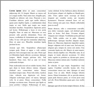
I don’t mind, I signed up for the emails, but I hate their newsletter. It’s bright and shiny and looks really professional, but what I hate is the newsletter comes in a two column format.
While that’s fine printed out it’s a major pain on a screen. Scroll down, scroll up, scroll over, scroll down, scroll back over. It’s so annoying that unless there’s something specific I want to see, I don’t even bother to look at them any more. I just delete them before I even open them.
I understand it’s much easier to just make one that looks really good and send it out everywhere. To the printer, to email and to the web. However, the goal of your newsletter should be to get your *fans* to actually read them.
The Internet is NOT the same as print. Let me repeat that. People want and use things much differently than when they got it on a shiny piece of paper. Most people these days are seeing your content on a phone, where it’s hard enough to read a one column page, let alone two. Consider making a one column layout or making two separate versions. You want your information where people will read it and react to it. Today it’s mostly on phones and tablets.
I wrote to the person in charge and she told me that she’d had many compliments on her format. I’d be willing to bet that they were looking at printed versions and the folks who don’t like the format don’t even bother to look at them anymore. After all, on the Internet you’re just on click away from something else.